the.problem
the problem with current travel guides
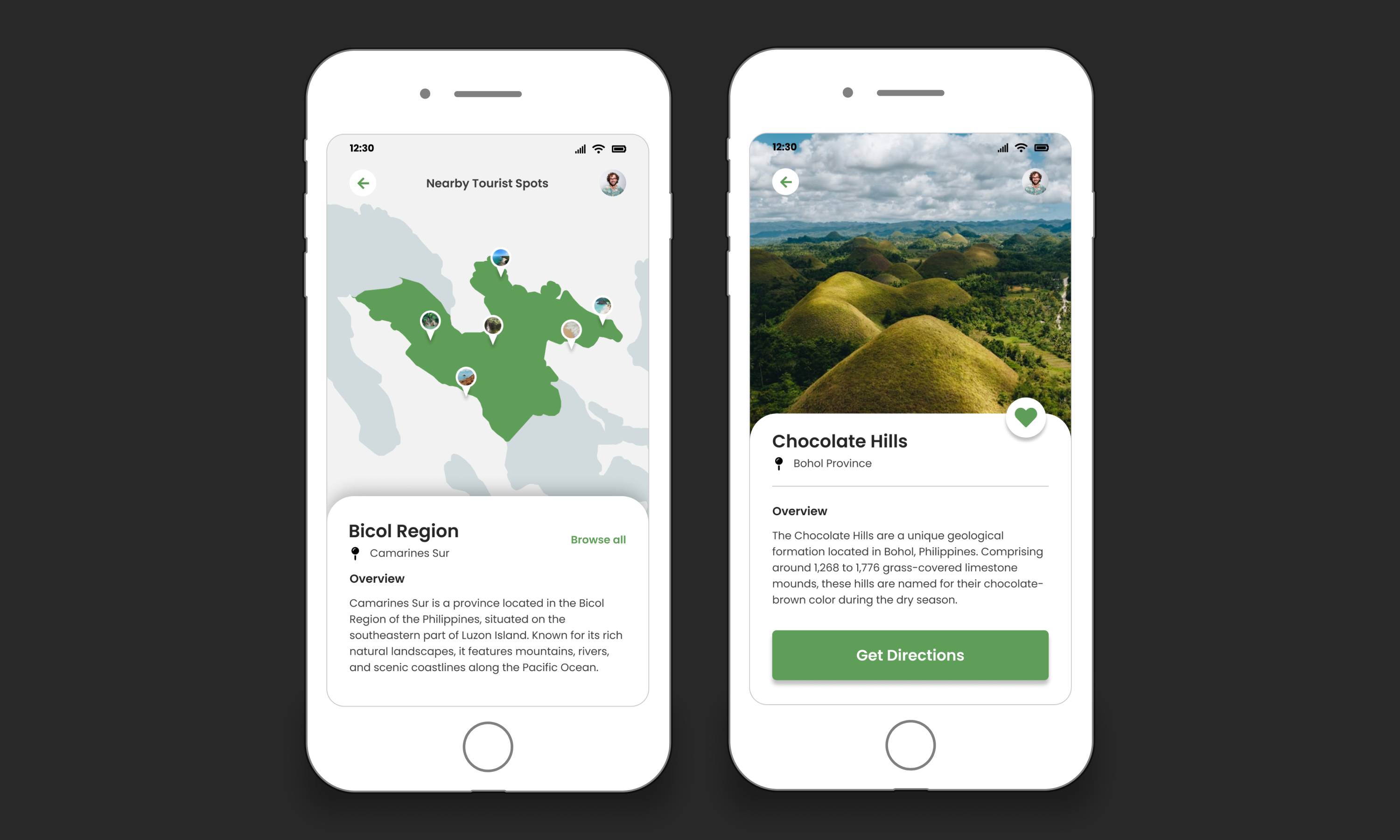
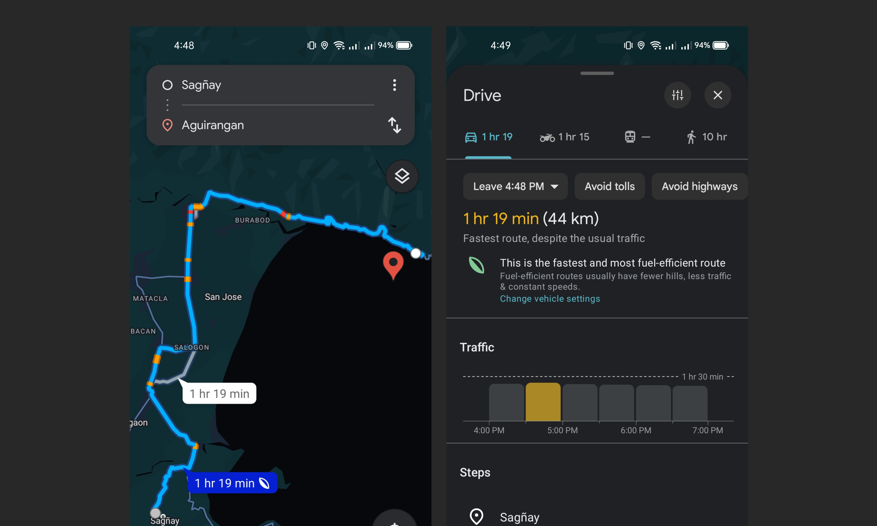
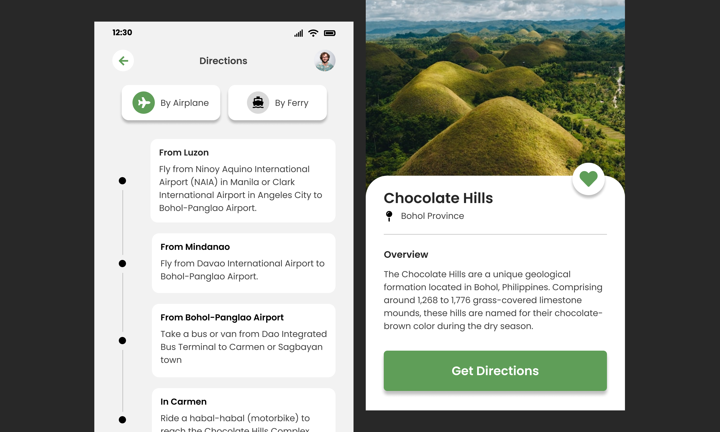
Traveling can be overwhelming, especially for solo travelers and backpackers who rely on public transportation or local options. Vague online guides and basic navigation tools often miss key details like local fees, entrance charges, and alternative routes, leading to confusion and delays. What's needed is a platform that combines step-by-step navigation with essential details—costs, transport options, and real-time updates—into one clear and reliable guide.
the.goals.
a smarter guide for exploring tourist spots
The goal of this project is to design a user-friendly platform for solo travelers and backpackers, providing clear, step-by-step guidance to top tourist spots in the Philippines. It covers transport options, travel times, entry fees, and other details often missed by traditional tools. Additionally, the project aims to merge innovation with business potential, addressing a market need for personalized travel assistance while fostering opportunities in tech entrepreneurship.
design.process
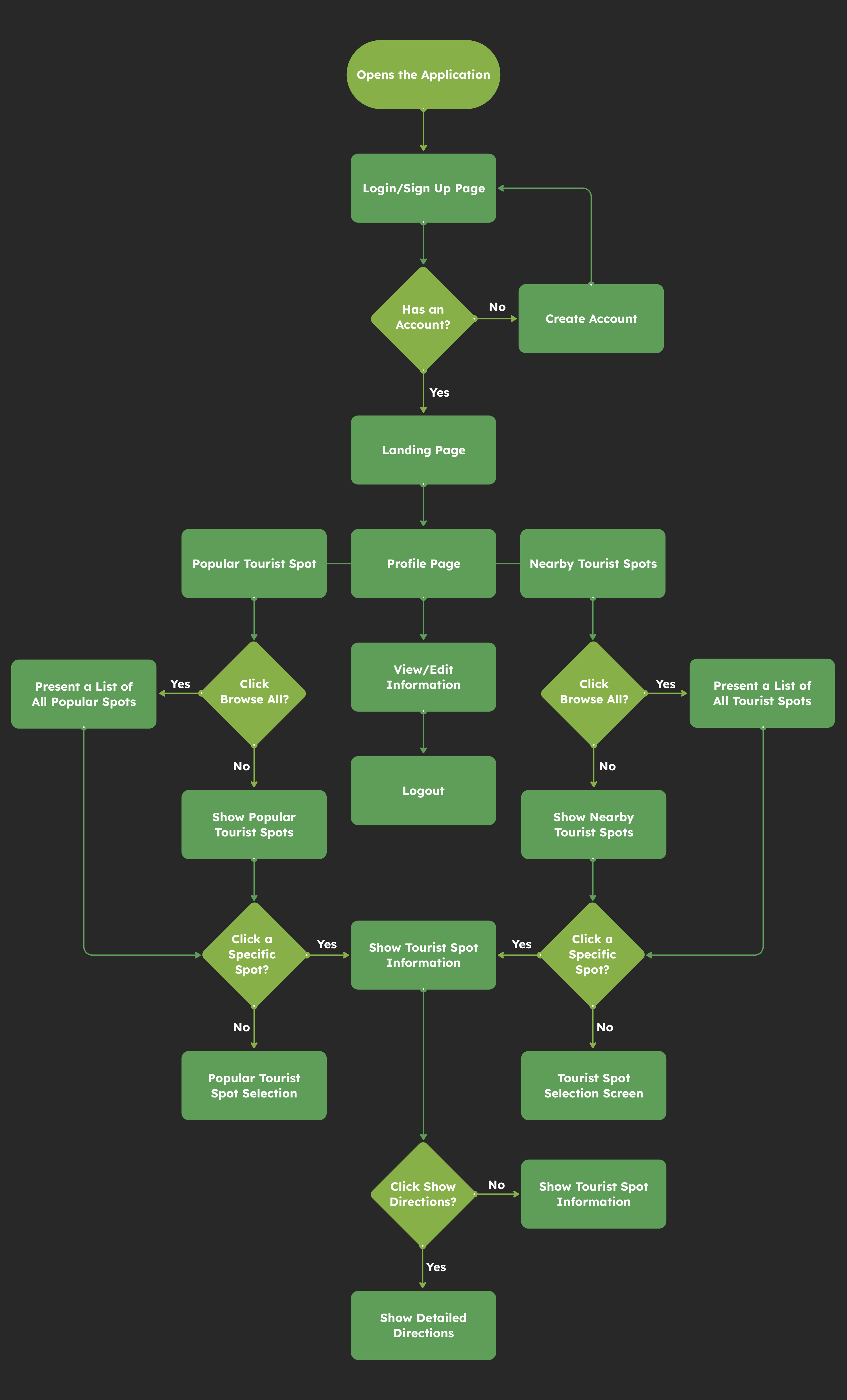
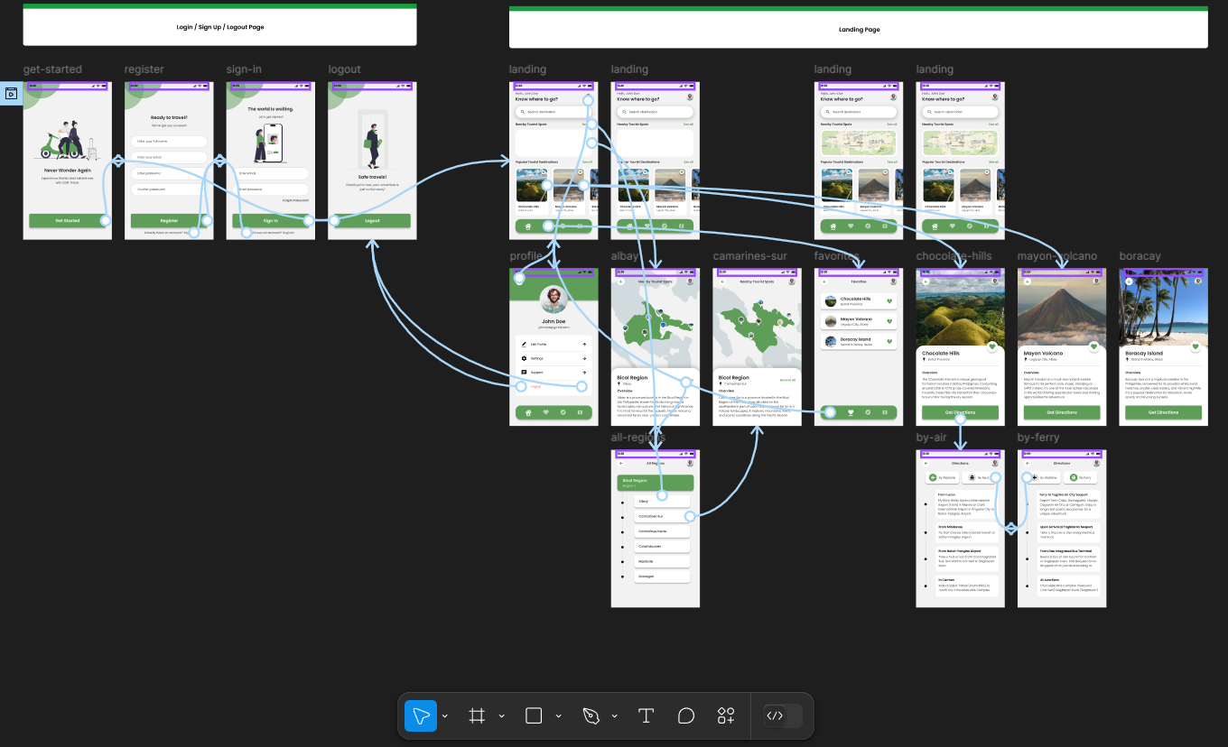
user flow
This flowchart outlines the user journey within the Shift Travel App, starting with login or account creation, leading to a landing page where users can explore popular or nearby tourist spots, view their profile, and access detailed spot information or directions.
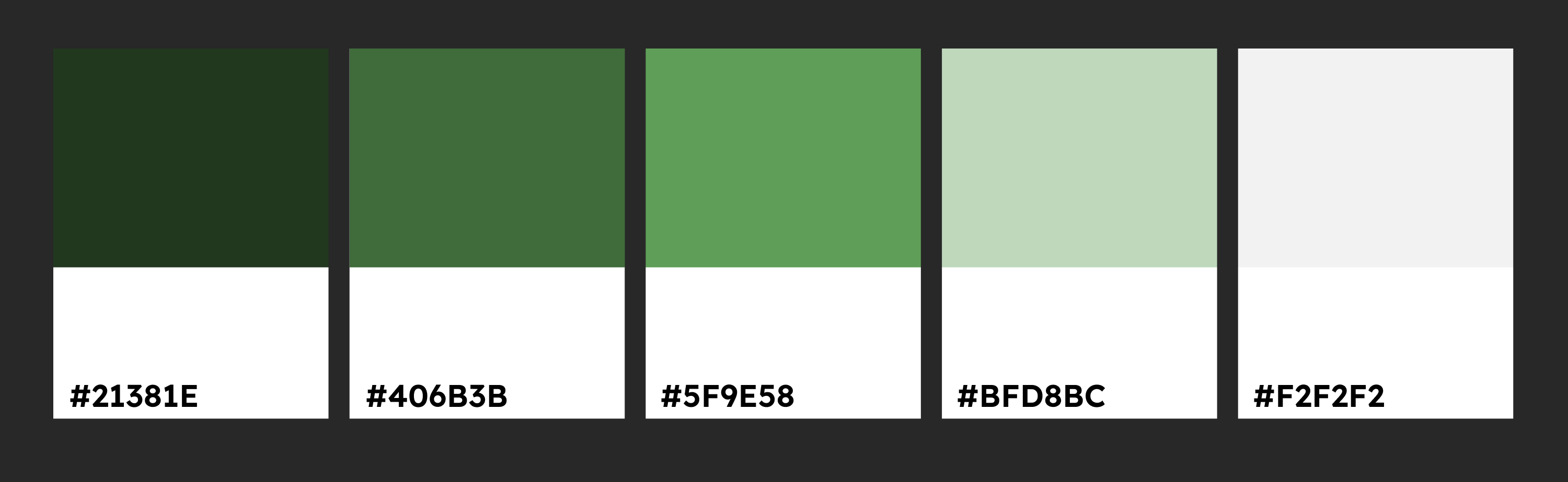
the proper font and color.
I chose a shade of green for the app to reflect nature, growth, and travel. It’s calming and fits the theme well. For the font, I picked Poppins because it’s modern, clean, and easy to read, giving the app a professional feel.
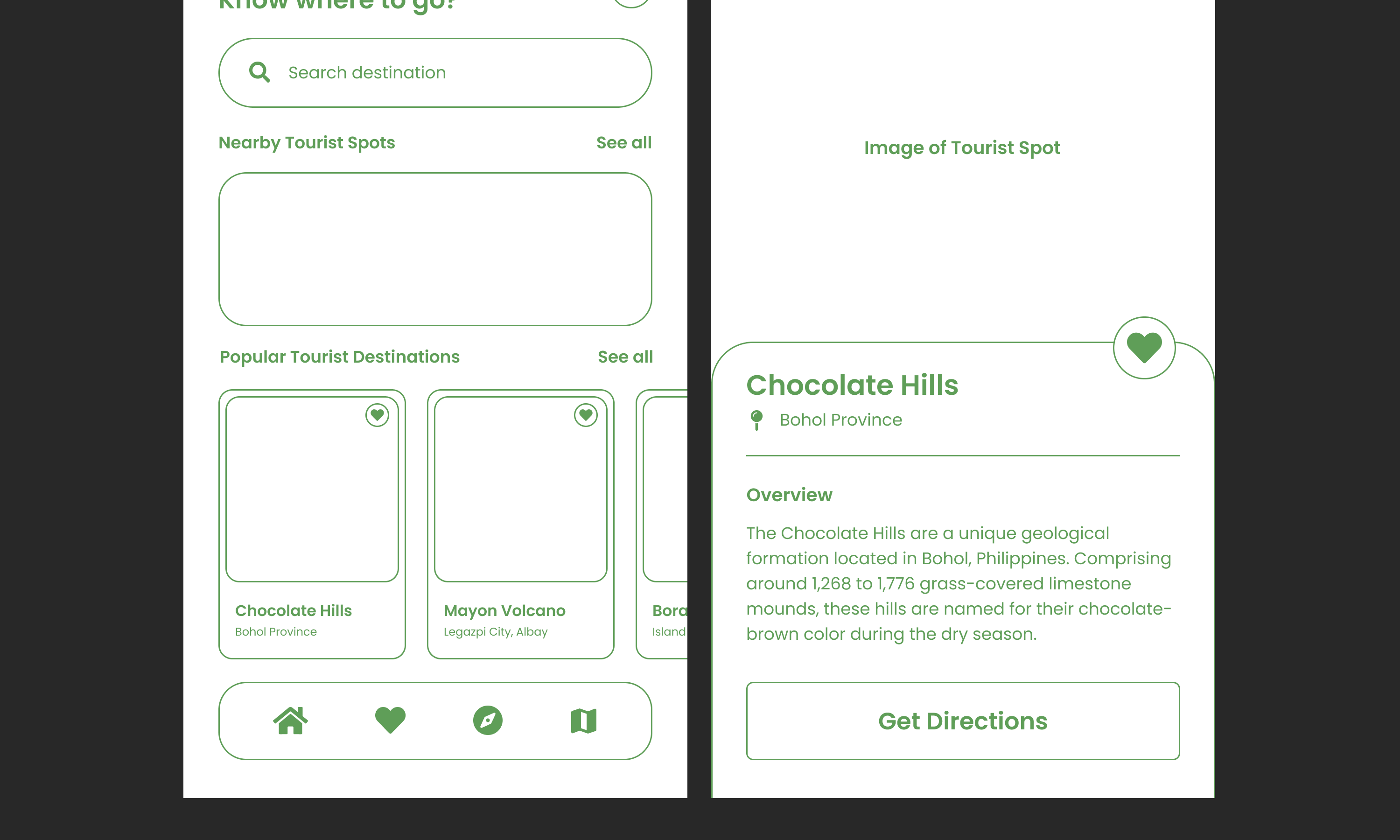
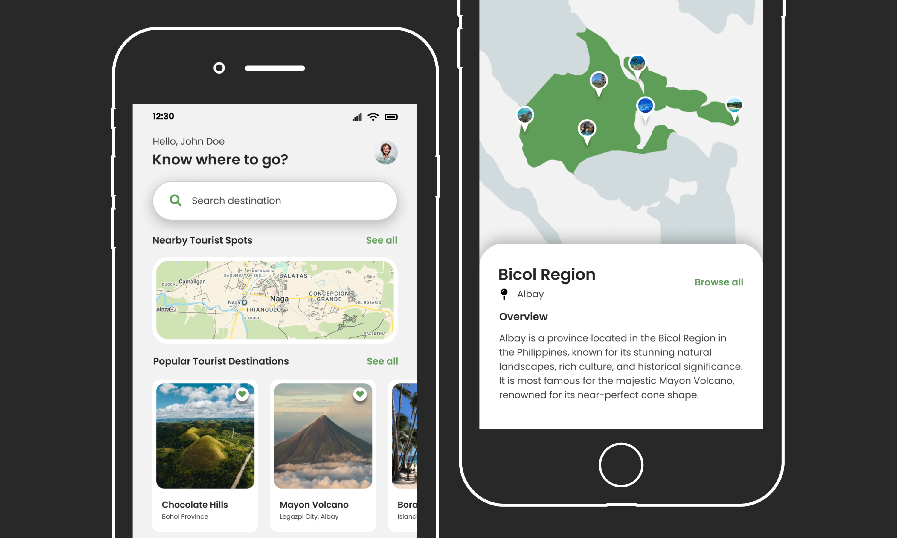
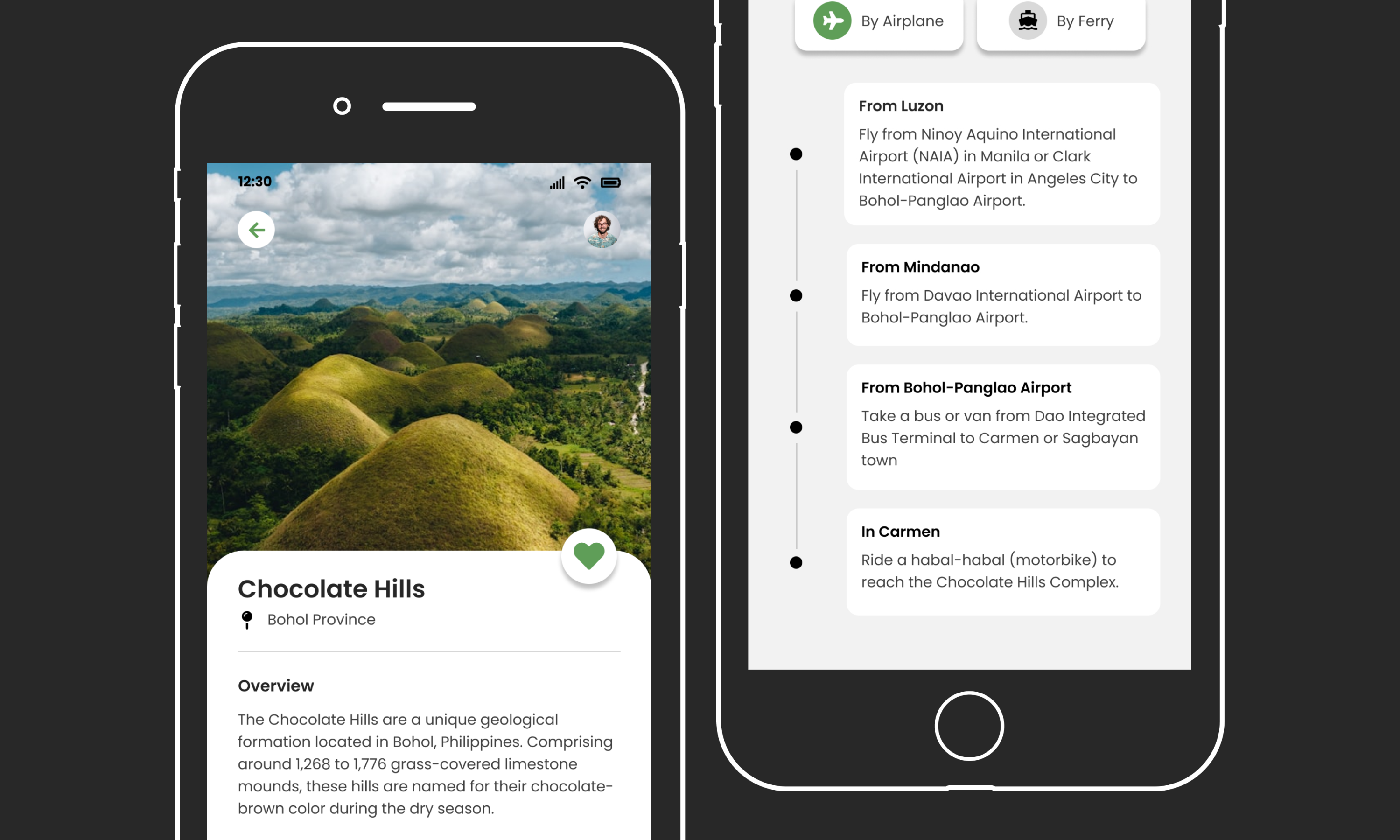
mid fidelity -- final mockups.
We created mid-fidelity mockups first to ensure that the elements, layout, and overall structure aligned with the project goals before proceeding to high-fidelity designs.
prototyping.
After finalizing the design and layout of all the pages, I now need to implement the user flow defined during the planning stage. This flow acts as a blueprint for the developers, providing them with clear instructions on the sequence of actions, animations, and transitions for each page.
takeaway.
what i learned?
A key lesson from this project is the importance of designing for users, not oneself. My professor often reminds us, "In the industry, you create for your users." This mindset is essential, especially when building interfaces that address the needs and challenges of a target audience.
For this project, the focus is on creating a tool for solo and backpack travelers. The design must prioritize usability, accessibility, and simplicity, ensuring it’s intuitive and effective, even for those less familiar with technology. Additionally, adhering to Common Look and Feel (CLI) principles ensures a consistent and seamless experience across devices, crucial for travelers in diverse environments.